Bringing the brand to life
Drawing inspiration from iconic buildings in cities like New York and London, we named the property "The Whitney" for its association with the Whitney Museum of American Art, symbolizing creativity and contemporary art, aligning with Texwood Group's vision.
Synergy between space & creativity
The Whitney combines space and creativity, mirrored in our seamless one-page website design, which balances space, design elements, and information to present The Whitney engagingly.
"Kinsman Design has created remarkable work for The Whitney building that helped us define not just this individual building but the new direction in which we are heading as a group"
Ben Wong
Assistant General Manager,
Towereed Properties Development Ltd (Texwood Group)
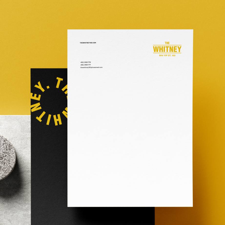
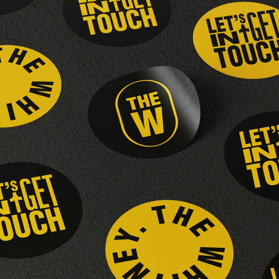
Taking inspiration from typographic posters, street signs, universal iconography, and other design elements found in urban environments.
The brand identity reflects The Whitney’s modern reinterpretation of industrial American loft-style workspaces. Each component is sophisticated, identifiable, and communicates an urban twist, incorporating contrasting colours, iconography, and bold typography. The Whitney’s full logo is contemporary with urban inspiration, while the simplified 'The W' icon quickly represents the brand.


Thanks
Many thanks to Ben, Jeff, and Norman for the chance to work on this inspiring project.
