200+ pages
5 languages
7 personas
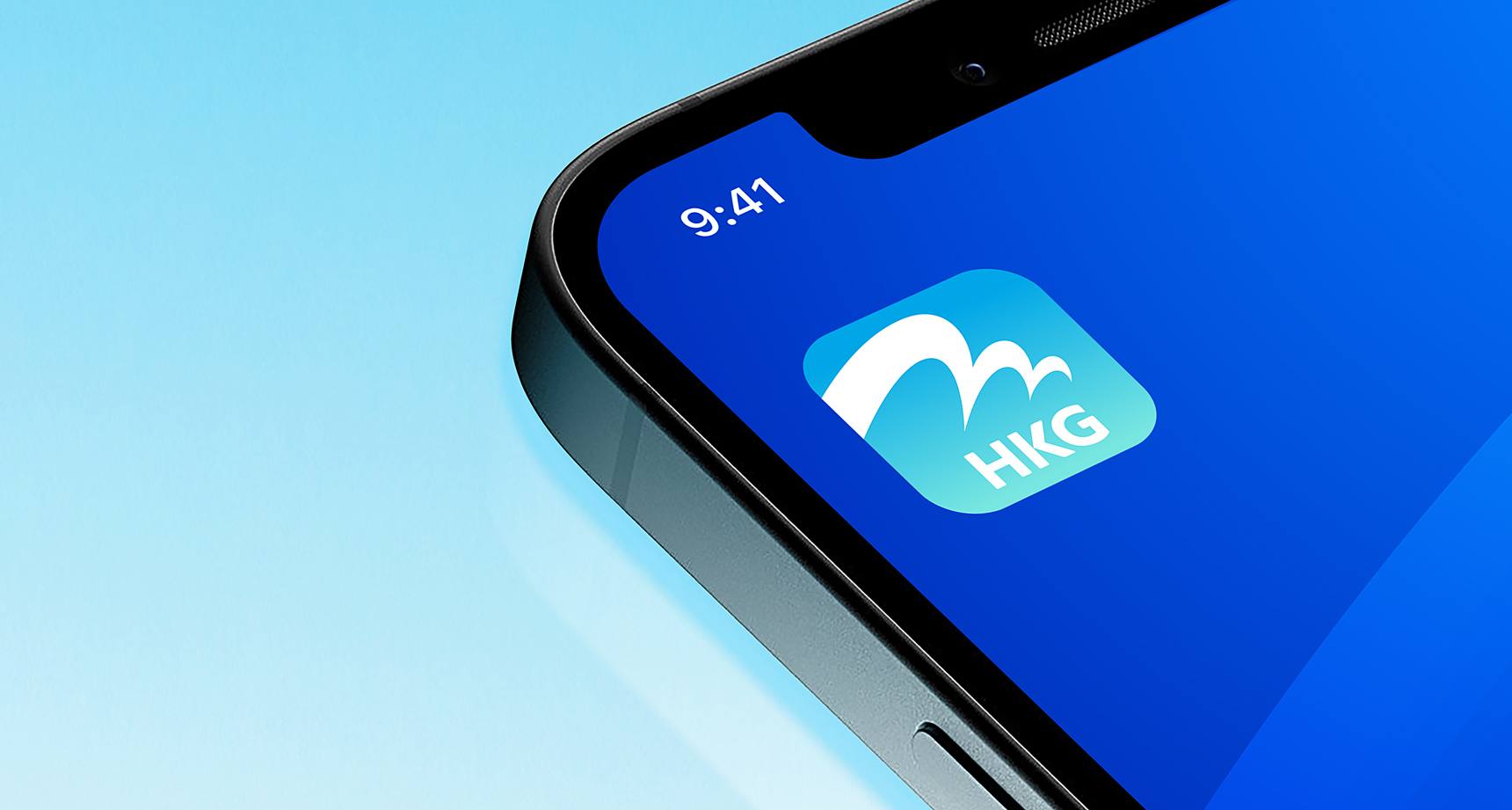
The new name, "My HKG," was chosen for its inclusivity and personal touch, incorporating the airport code and the personal element “My”.
Naming
The original app name, HKG My Flight, was found lacking as it didn't encompass the full range of services. The new name, "My HKG," was chosen for its inclusivity and personal touch, incorporating the airport code and the personal element “My”.
Brand Identity
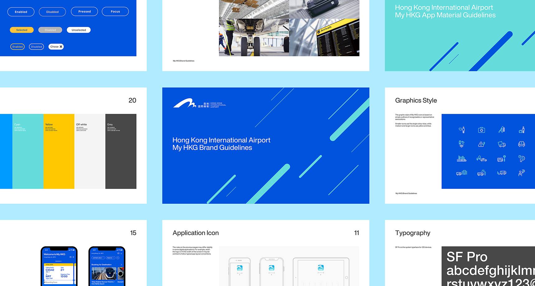
To instil the brand personality into the brand identity, we ensured our updates were purposeful, not merely for the sake of change. While maintaining the iconic HKIA logo, the app’s typography was refined to be friendlier.
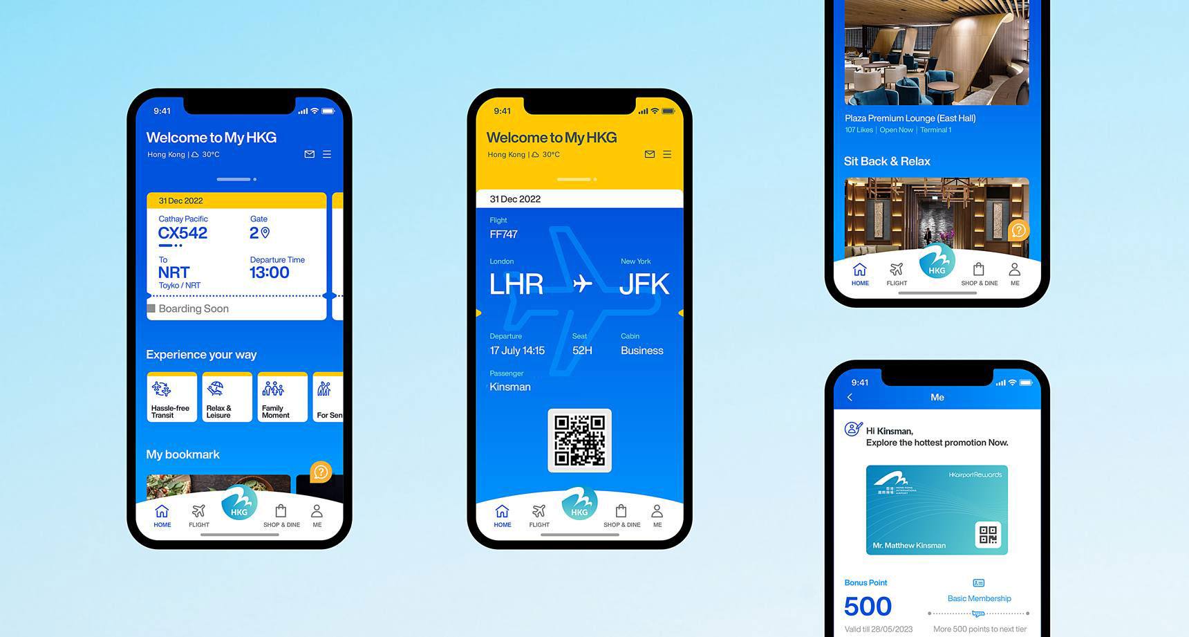
Real-time flight updates
Boarding alerts
Baggage arrivals
Signage translation
Locations guide
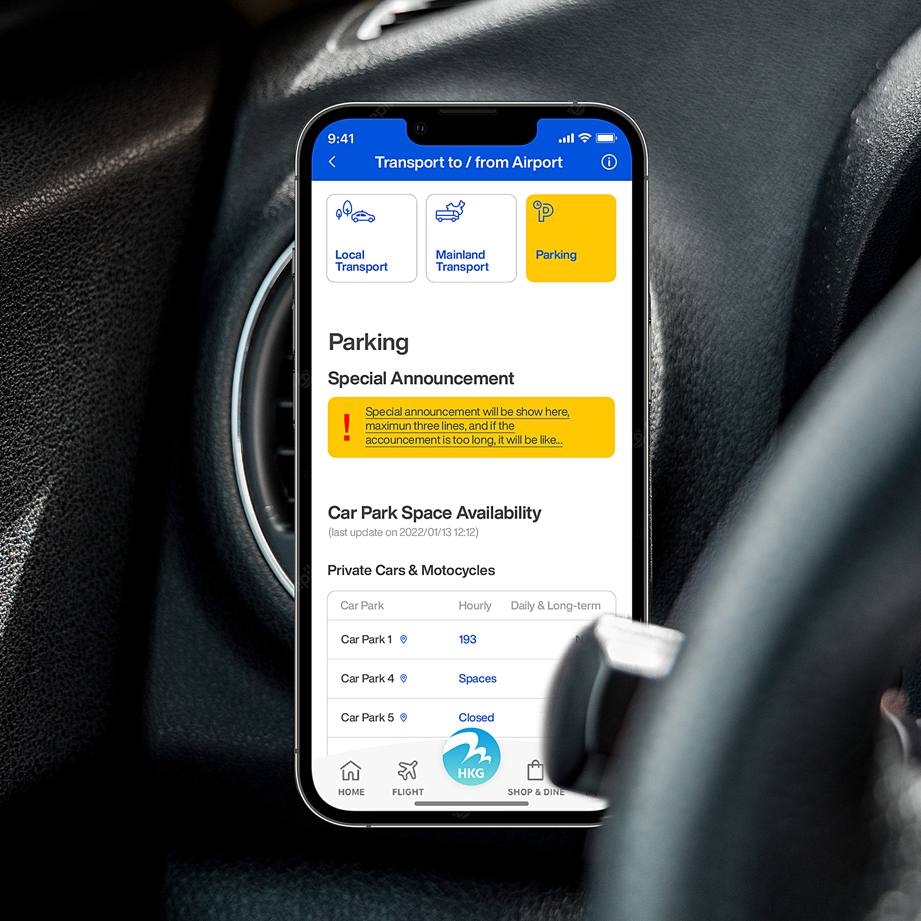
Car park booking
Food ordering
High functionality
The challenge for My HKG was not competing with other mobile apps, but about vying for the attention, time, and memory space of travelers arriving at HKIA.
Research and Insights
Although My HKG is an extension of the HKIA brand, it fulfils a more specific and personal mission. By conducting a comparative analysis of leading travel brands and their companion apps, engaging in high-level workshops with Hong Kong Airport Authority executives, and gathering user expectation insights through Social Listening, we developed a comprehensive brand strategy for all subsequent project developments.
We create personalisation that filters content based on the time relative to the user's tracked flight.
For example, features available 24+ hours before boarding include transportation, boarding ticket and travel checklist, while those available 3+ hours before boarding focus on car park booking services and navigation to check-in counters.
The color scheme was revised for greater contrast, using a dark blue background complemented by vibrant yellow accents and the airport's signature wisdom blue.
A Promise Of Personalised Experience: Experience Your Way
Brand Strategy
The strategy behind My HKG was to offer a one-stop, personalised journey for all travellers, encapsulated in the new brand promise, 'Experience Your Way.' This approach ensures that travellers can navigate the airport seamlessly — whether they are arriving, departing, or exploring within — find their entertainment, and access exclusive, reliable information.
An approachable brand voice
Taking insights from social listening, we decided to craft an app that can anticipate travellers' needs and enhance their experiences by providing assistance to their personalised journey planning. We updated the brand personality and tone of voice to be approachable and friendly, reflecting the brand's personal, cosmopolitan, and intuitive values

200+ Icons
We developed a distinctive, digitally-friendly iconography system to convey information visually, transcending language barriers.
By analysing extensive user research, we identified pain points, defined user personas, and optimised information and feature hierarchies to shape the app's UI and UX design.
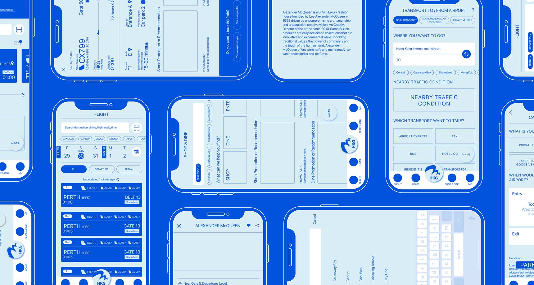
User Interface
The UI design prioritized user-friendliness with clear buttons, uncluttered layouts, and updated typography.
Our aim was to ensure that the most essential information for each user persona was accessible either on the home page or within one touch, ensuring a hassle-free experience.