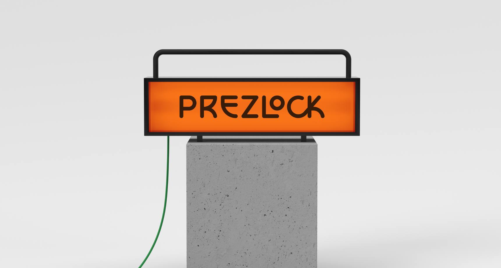

The name "Prezlock" was selected as it alludes to the finger-press unlocking feature. It was chosen as the final option after evaluating various naming possibilities in different contexts, considering its sound, rhythm, and ease of pronunciation.
A bold brand that embodies the company's vision and positions Prezlock as an innovator in its market.

Prezlock was selected as the final name as it hinted at the finger-press unlocking.
The name 'Prezlock' was selected as the final option after evaluating a range of naming possibilities in various contexts, considering its sound, rhythm, and ease of pronunciation.


We crafted a brand voice that is bold, energetic, and passionate.


"a great collaboration over almost a year"
“Prezlock is a disrupter in the lock industry – with a fingerprint key and a customisable funky design, it was designed to appeal to style-conscious teens to 30s for students, gym and luggage.
We partnered with Kinsman Design to help us to define the brand strategy, identity, eCommerce and activation plan. We had a great collaboration over almost a year, and as we were breaking new ground with the product, the business model and positioning needed many rapid adjustments and calibrations until we found the sweet spot with the target customer group."
Paul Tsui
Founder and CEO
Prezlock


The brand narrative focused on the end consumer benefit of 'peace of mind,' highlighting the security provided by personalised fingerprint unlocking.


We created a set of functionality icons optimised for digital use and visibility at different scales.

A colour palette was chosen to reflect the energy of change.

The brand identity included a cohesive visual language, colour scheme, photography, and tone of voice, all working together to position the brand as a catalyst for change.


Thanks
Many thanks to Paul for providing us with this exciting opportunity.