Brand identity reflects Eatology's dedication to inspiring and empowering healthier eating habits.
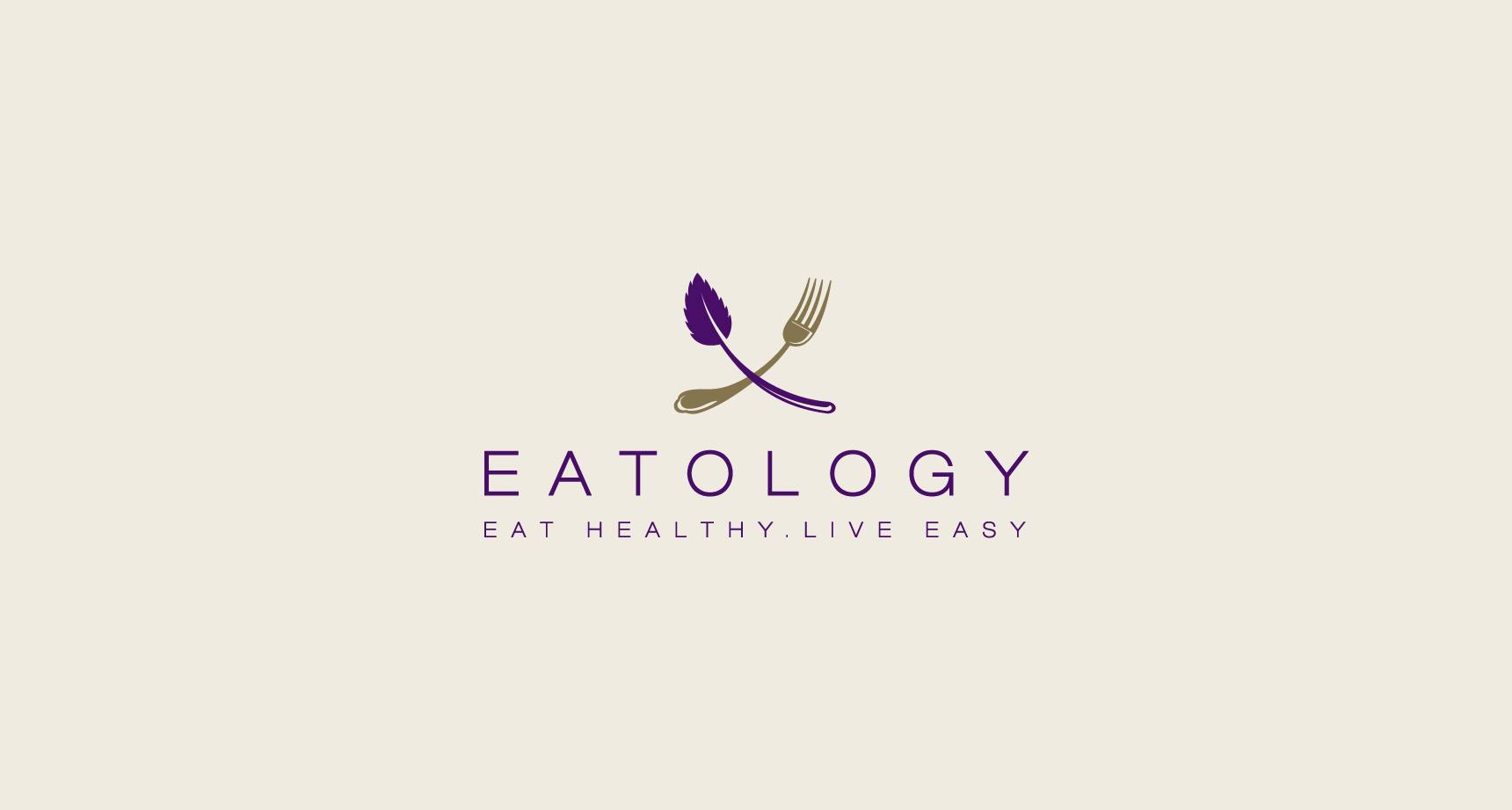
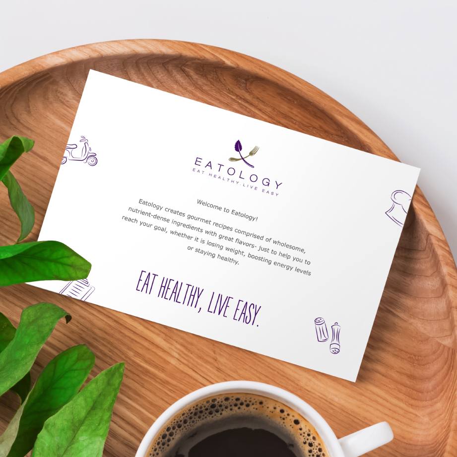
Eatology's cohesive identity ensures recognition and harmony between service and brand. "Ology" denotes the scientific foundation of Eatology’s service, supported by a logo featuring the fusion of a fork and plant, symbolizing nutritious dining. The use of purple signifies sophistication and aligns with many nutrient-rich foods of the same hue.

eat healthy
live easy
We devised a progressive brand promise, positioning Eatology as a leader in the sustainable and health-conscious sector.
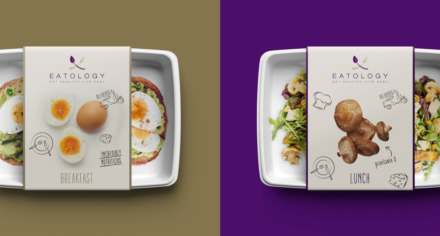
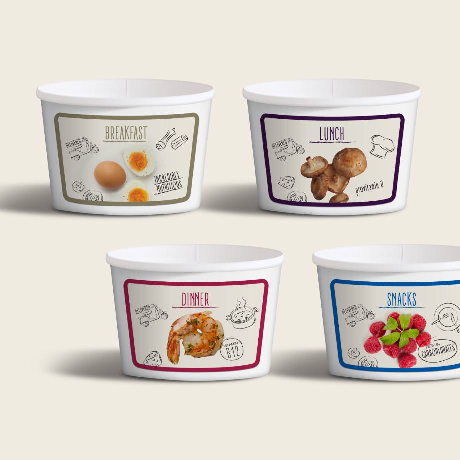
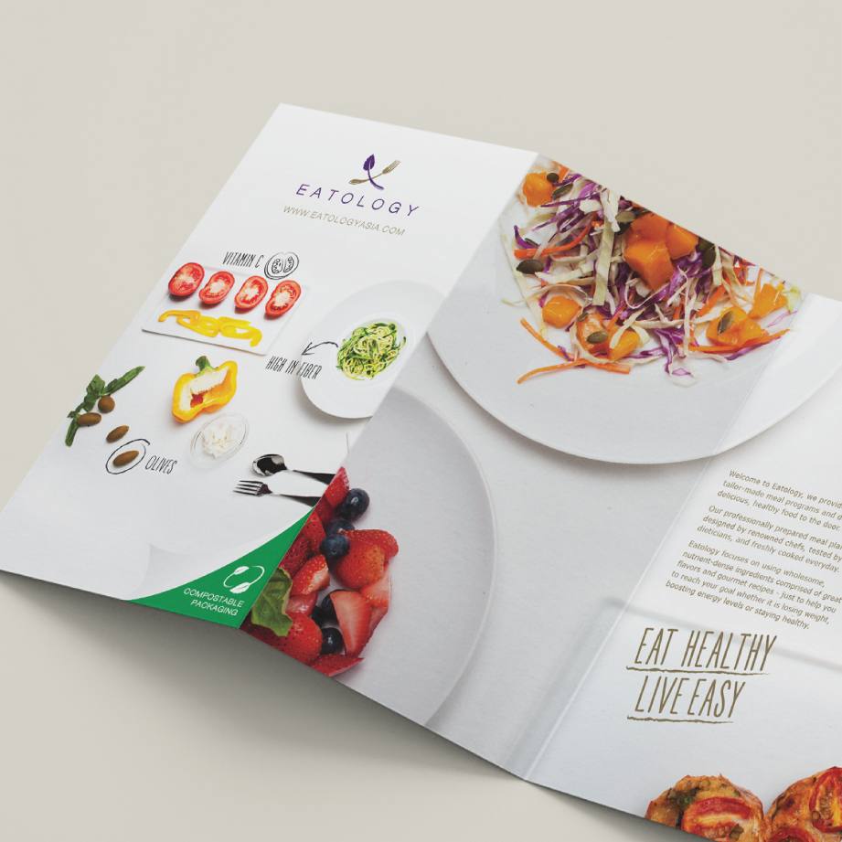
Eco-friendly, compostable packaging underscores our commitment to sustainability. We designed packaging that highlights the naturally nutritious and vitamin-rich ingredients.
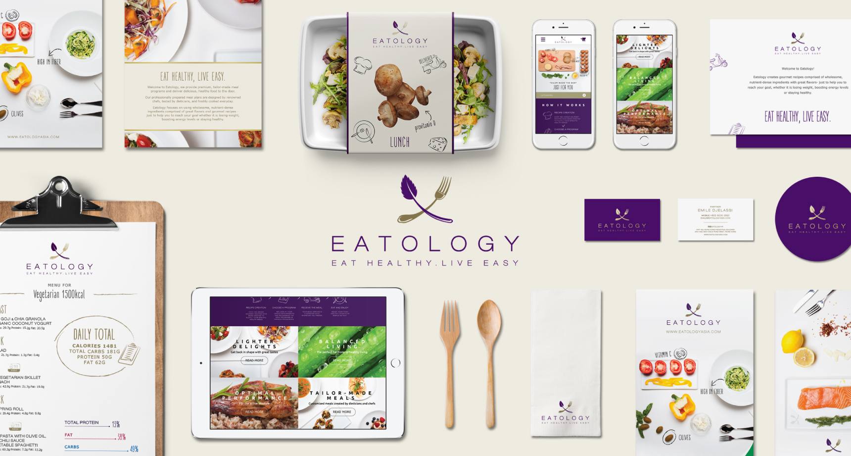
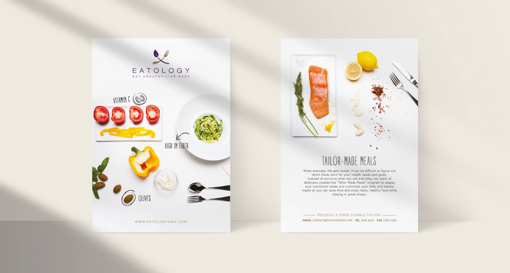
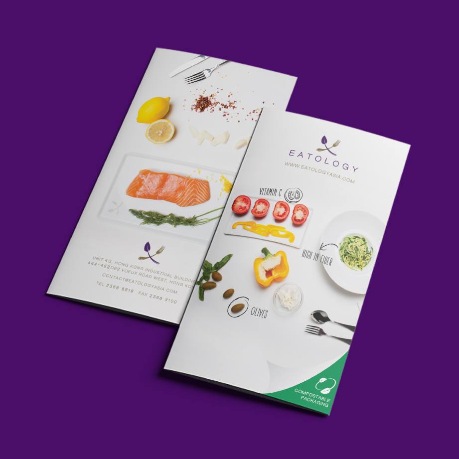
We equipped Eatology with consistent brand activation tools, including brochures, stationery, and meal instructions, all designed to streamline the dieting and eating experience.
The design system underpins the Eatology experience, unifying the audience through consistent visuals and messaging.
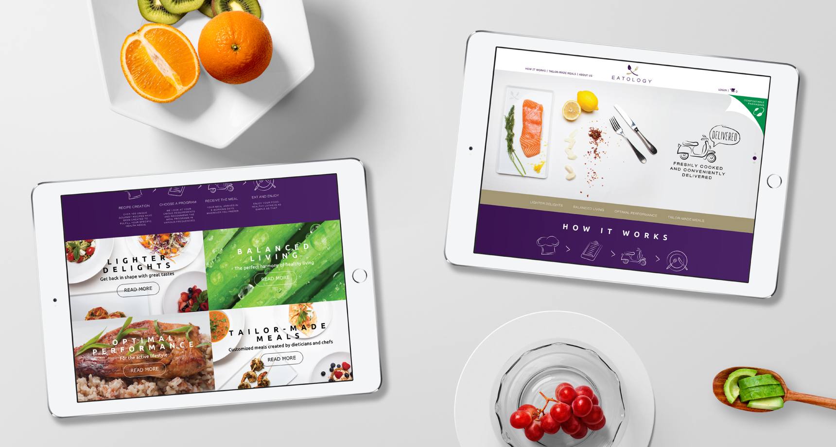
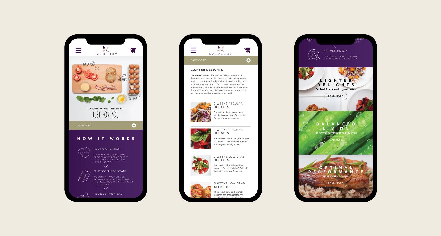
The mobile-first website simplifies the meal plan registration process.
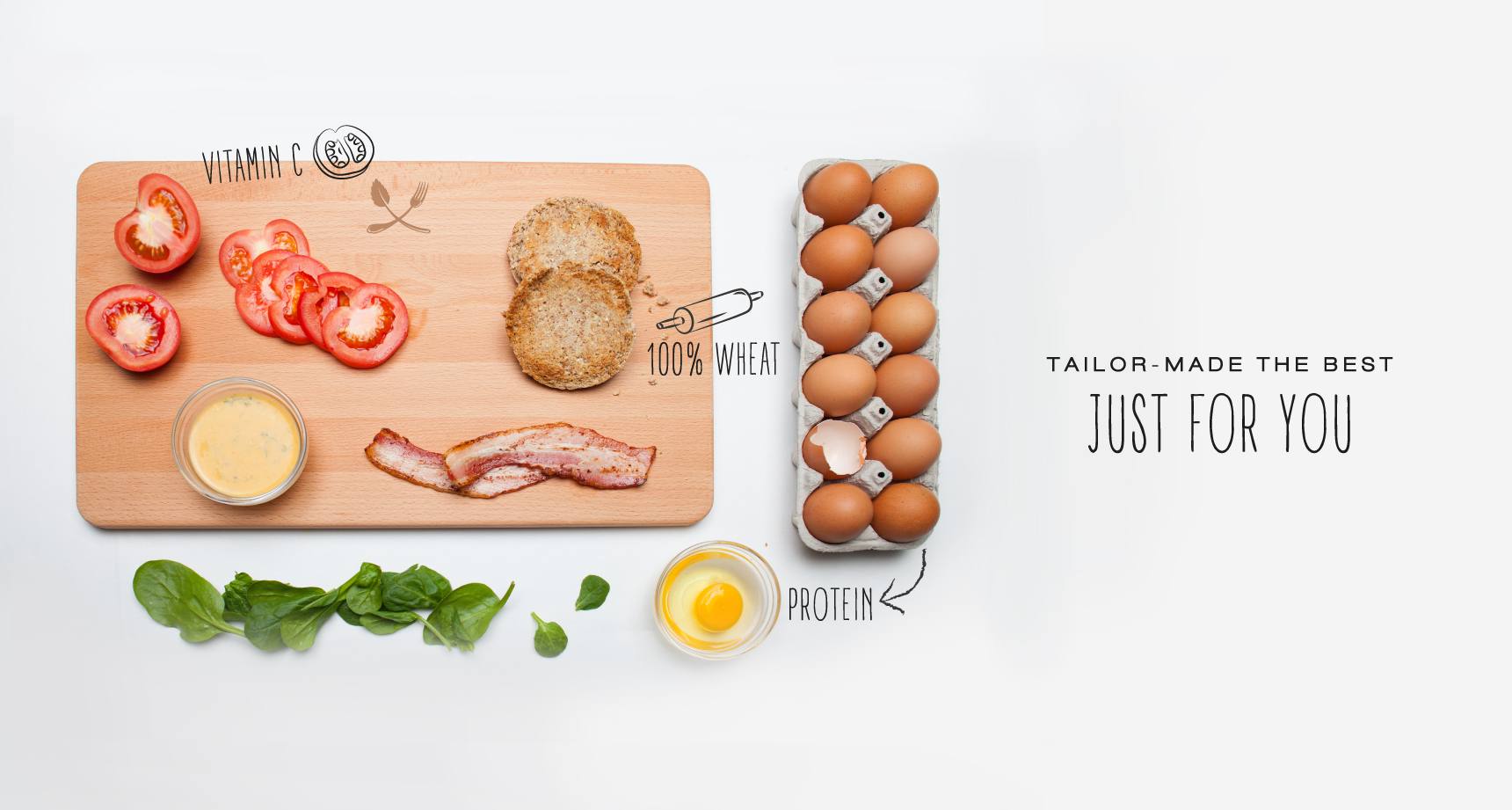
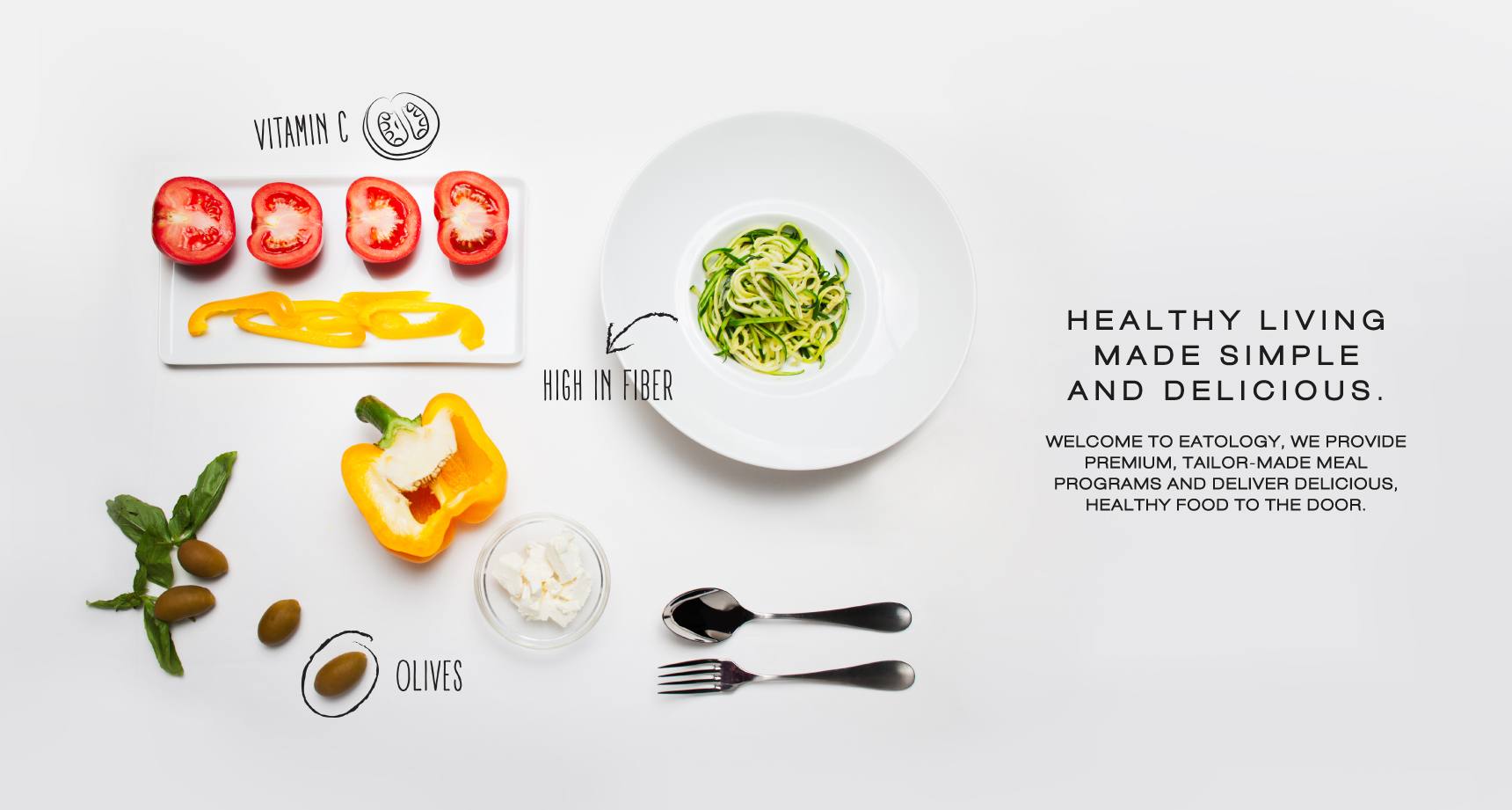
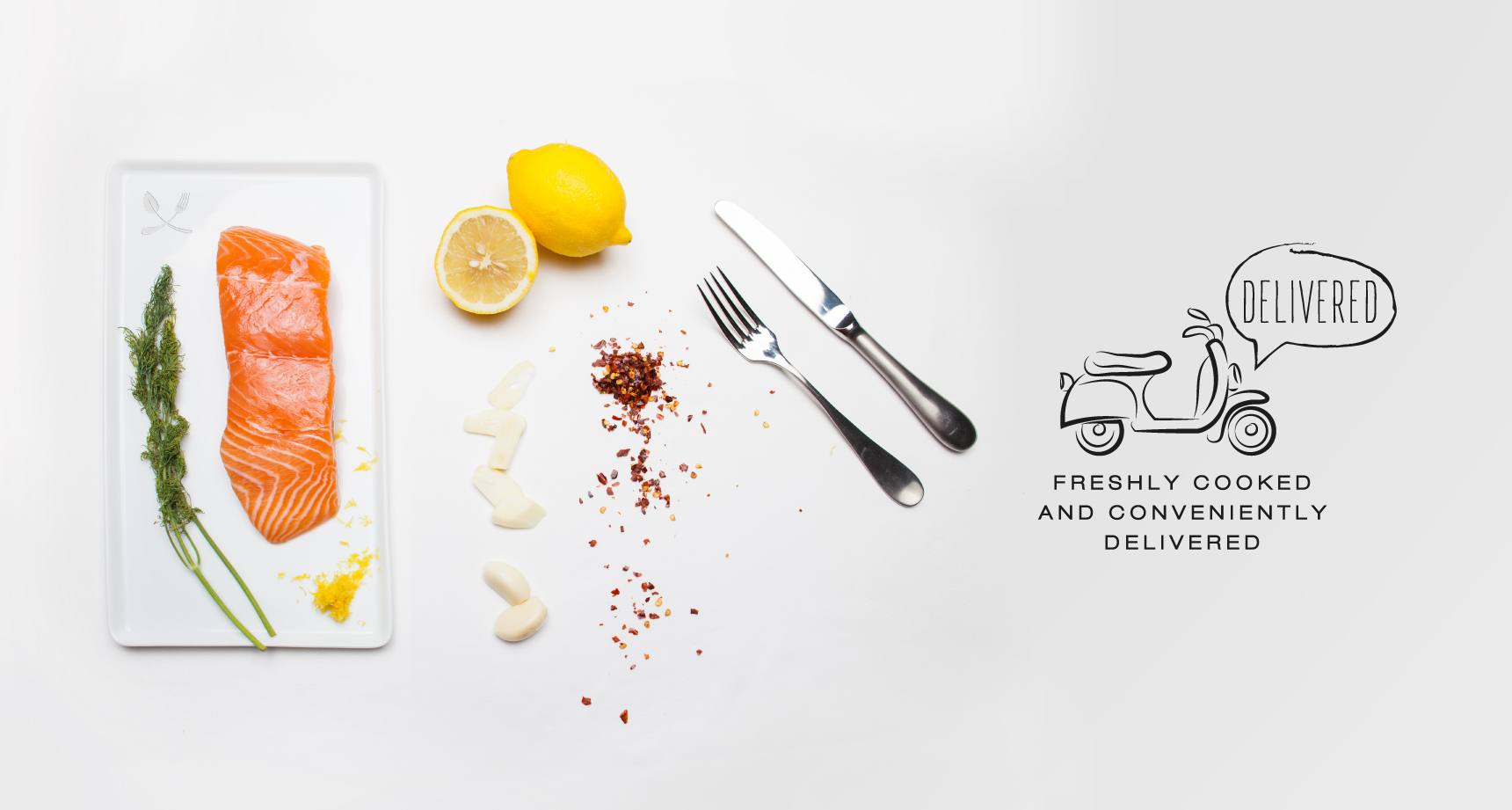
Our photographic style emphasises the variety of fresh ingredients in each meal, strengthening Eatology's bond with its customers.
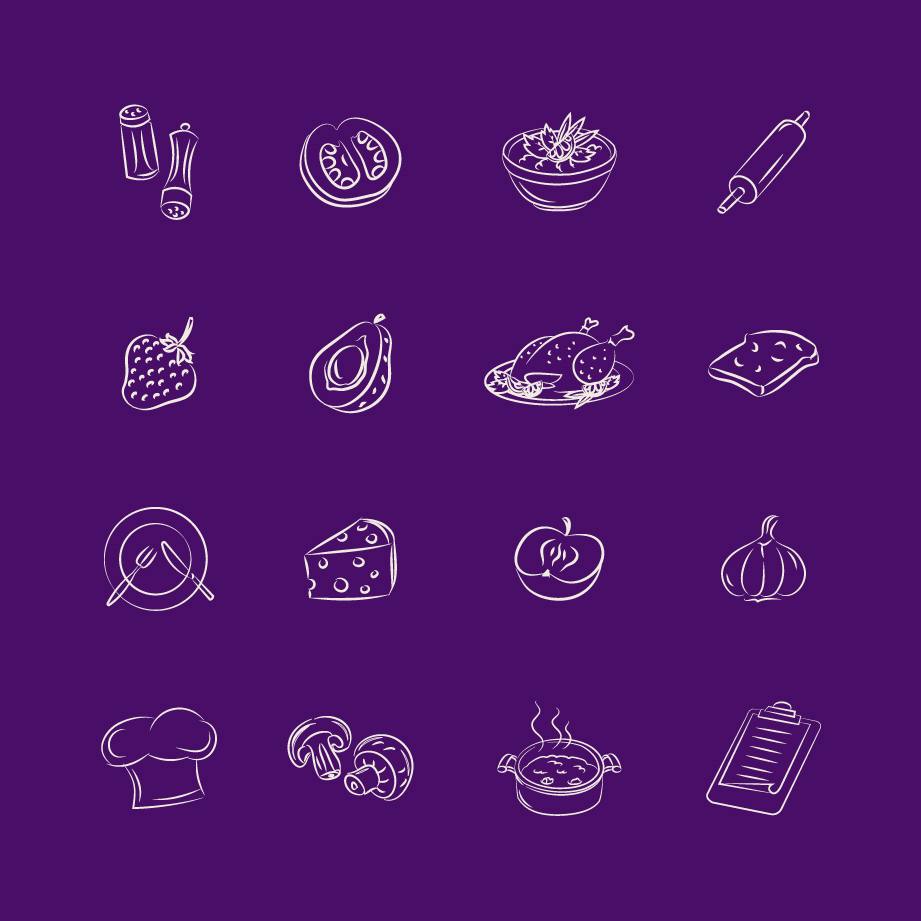
The brand's familiar curves inspired the creation of digital-friendly icons.